Thursday, November 7, 2019

Space Cowboy Concept

More drawings from my art class. We're going to be doing character design for the next few weeks. And finally we get to stylize our drawings. All the character concepts have to be based around the theme of Space Cowboys. So I came up with this character. I'm especially happy with him because I actually went through the silhouette and thumbnail process before just diving right in. That let me pick and choose from the designs I liked best and combine them all into one final design.

You may have notice that the pose is a lot more dynamic than what I'm usually up to. That's purely because of what I've learned in class. I used a line of action and the "draw through" technique on his head. I should've included his hat brim with that too before I drew everything else. Something to remember for the actual assignment.

This drawing isn't going to be one I submit, which is why there are still some "errors" and a lack of shading. I just wanted to have fun drawing him. Praise God.

Insect Drawings

There are two more drawings I did for my art class this semester. For a long time I've been fairly good at reproducing images (if they're not people) with enough time. You can find these two images with a little Google searching, but I still signed them because I consider the drawing and shading and whatnot my work. Maybe I've got the wrong idea.
Anyway, this top picture is clearly of a spider. I like the pattern on it's abdomen.

And this is a drawing of a bee. I used my wonderful new precision eraser for some of the hairs. I like how fluffy it ended up looking. And the abdomen actually has some shape thanks to the direction of the shading.

Anyway, I like both drawings so I thought I'd put them here. Thanks be to God for everything.

Wednesday, September 25, 2019

My Friend Ink


This is a piece of art I did for the art class I'm taking. It's a drawing of the library here at my university. I've been meaning to post some of the art I've done for that class so far, but I haven't gotten around to it. So I thought I would at least post this tonight. It's a 2-point perspective drawing, which I'm only just learning how to do. I used pencil to outline the drawing and ink grey pens and a black pen to do the shading. I haven't really done much shading before because it took so much work, but these pens really really helped. I had fun exploring what the pens can do and combining them to make in-between shades. I'm happy with how the trees turned out, especially the ones on the left. I wasn't sure how they'd look. I also really like the water here. It looks how I wanted it to. And the umbrellas have a nice outline to them.
I thought I'd include images of it in different stages of development, since I took them.
Praise God from whom all blessings flow. God help me to swallow my pride in both directions and teach me that sometimes the only person being hard on me is me. Thanks for this picture. I love you. God's will be done.

Friday, August 23, 2019

Life Giver

One of these days, the artwork I actually imagine will be what I end up making. That's an exaggeration, but I feel like I keep ending up with a less impactful composition than what I intend. And I especially feel that with this one since I've had this character in my head for so long. Anyways: this is Life Giver. You'll notice her picture is similar to the After Avengers', but it doesn't share their logo. That's because she's not an After Avenger. She's their villain. When I originally conceived the After Avengers, I didn't know Marvel wasn't going to be doing any more massive 3-phase story lines in order to opt for smaller stories. And that makes good sense, but for the After Avengers I wanted to imagine a 3 phase story with an overarching villain and everything. Life Giver is that villain.

I wanted this new villain to be wildly different from Thanos. After all, if your new villain is going to be exactly like the old one, why even come up with a new villain in the first place? So I knew I wanted the villain to be a woman from Earth not space; preferably a kind of evil mom archetype to match Thanos' evil dad themes. And I wanted her evil motivation to be built off of the idea of the Avengers.

Her name is Zoey Jonadab. From a certain interpretation it means "Life Giver," hence where she found her supervillain name (she was fascinated with her name even from an early age). She never had to live in a world without Avengers. Instead, she grew up in a world of absolute automated comfort and peace. But instead of helping humanity to be better, all we became was lazier, more depressed, and more self destructive. Life Giver believes that our modern societies have become so adept at creating comfort and happiness that life has become meaningless. So in her mind, the solution is to reintroduce pain and unhappiness so heroes like the Avengers can exist again. This character believes that, since the Avengers defined an entire generation, a new villain must arise in order to define the next generation. That's where she comes in. 

Unlike Thanos, she's not a very physical or confrontational villain (as you can probably guess from the dress). Instead she allows her genetically created monsters to do the fighting for her. This would hopefully allow for a lot of interesting and diverse monster designs and power sets. I think it would be really cool to watch the After Avengers fighting with a t-rex/lion's mane jellyfish hybrid while she sat calmly in the center of it all. 
I wanted a vaguely Kirby-esque design to give her an interesting silhouette, so I played around with different crown and head designs until I got this. I like how nonthreatening her long ears make her look. I was kind of inspired by a doe, but I wanted them to be furled like a Blue Dragon from Dungeons and Dragons. And yes, those are her actual ears. They allow her to hear much farther distances and in ranges that allow her creatures to communicate with her.


Originally I imagined the top image was going to be from the side. I thought it would look very distinct from all the After Avengers' pictures. I drew the draft in the middle. Then I drew the real thing, and it just didn't look as good. Oh well. I shouldn't really complain. I think she looks great. The bottom picture is what she looks like without the head piece and with one of her ears both furled and unfurled.

I'm at school now, and it's going okay so far. Thanks God for letting me finally do this, for giving me all these great ideas, for getting me through every day here, and for yourself most of all. Love you. Amen.

Thursday, August 15, 2019

That One House

This is my first draft of the Day house. In other words, it's the house where the model supervillain family lives. Recently I wanted to practice creating a setting that reflected not only the surface aspects of a character but also the darker internal parts in a way that didn't break the realism. I figured Harrison would be a good pick for that project. I didn't do much detailing or atmosphere. I just wanted to see the basic design of the house and area around it. I really like that the Day house looks like one that could actually be built in a moderately wealthy neighborhood. It's not over the top or obviously uninviting. It just has little details that give it an ominous look.

That said, I did take inspiration from Disney villain lairs. Gru's house from Despicable Me was also very helpful, particularly because I could see it in contrast with the other houses around it. That way I could tell which subtler details made it stand out: the steeper angles and thinner windows. But I'm especially proud of the second story window in the center. The blinds really help to sell the double sided paranoia. I originally imagined the house with no garage. I only realized I needed one when I was looking at other houses for reference, so I made it a separate building. It's better like that anyways.

But my favorite details are the ones I thought of before I started drawing. The ones I wanted to add for the symbolism. That single lamp is one of them. It symbolizes a lot of different things. It's not motion sensitive. It turns on automatically at night and stays on until morning. I'll be leaving home soon, but God will still be with me. Thank you God.

Monday, August 5, 2019

Biot


Finally. The final After Avenger is complete. I realize it's taken me a while. I really didn't have much of any idea what to do with this character. I knew I wanted one more After Avenger, and I knew I wanted a big character so that there'd be some obvious visual contrast with the rest of the group. But I just didn't see how to make an interesting big character or what modern movie genre I could get ideas from. I knew maybe he'd be a robot of some kind. But if so, what? Eventually I realized I don't really connect with "big" characters in comics, so I tried making one I could.

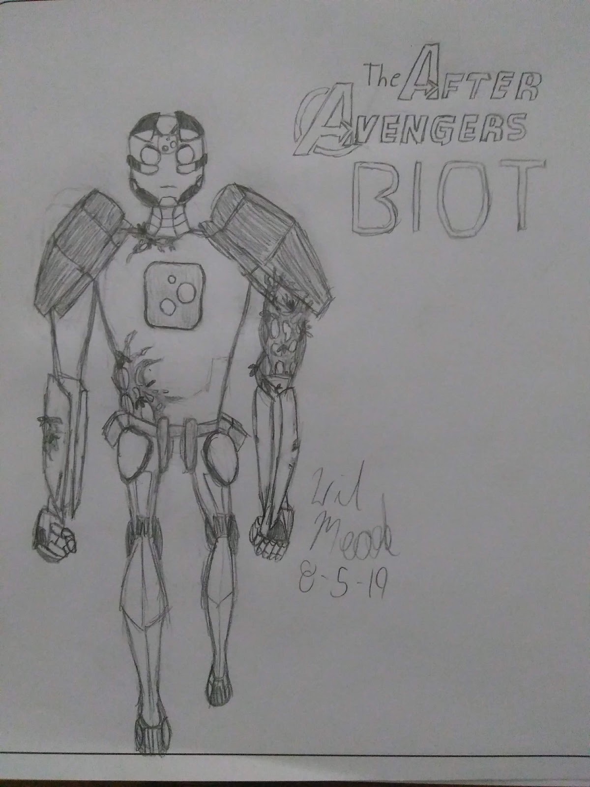
To that end, this is Biot. It's a portmanteau of "biological robot." I didn't make it up. He's a farmer from an alternate universe where robotic life developed on Earth. On his world he was something of a failed hero, but on ours he's become an Avenger. One day, a form of complex biotic life fell to his Earth attracted by his experiments. It bonded with him and gave him the ability to camouflage and manipulate biological systems (including healing them). I got a kick out of the idea of a born robot fusing with a biological alien, and I liked the idea of a stealth and healing big character. I based him off of some independent films and other independent projects that I know. Ironically, as the only main CGI character, he'd be the least likely to be made an independent film about. Though hopefully some of his parts could be done with a suit, like the ones they use at Disney's Pandora.

As you can see, I included another color palette. His main body is silver white. His lower legs, the inner part under his eye, the tips of his fingers, his hips, his headpiece, and part of his chin are yellow. His shoulder armor, the backs of his hands, knees, and eyes are purple. Some parts of his armor and head armor are black. His chest square and waist are blue, and the plants are green.

This pose isn't very exciting because originally this was just going to be more brainstorming art. But then I kept drawing and kept drawing and wound up with something I liked. It would still need to be passed through a concept artists room or something. Like his eyes, for example. They'd probably need pupils for the sake of the actor, but I left them like this. You can't see it very well from this angle, but his legs bend backwards instead of forwards. From the beginning I knew I wanted him to have backwards legs. It'd give him an interesting silhouette from any angle other than this one. You may notice this drawing doesn't have the same notebook paper lines that the others have. That's because it's the first drawing in the new sketch book I got for my birthday! It's got the name of this blog on the cover and everything. It's very cool.

This was him before I added the plants.

  
And these drawing are concept art I did when I was still trying to figure him out. Originally the three dots around the face were to make him more like automated turrets, but then I realized how well they worked as a symbol for him jumping between worlds. The dots on the face would be regular eyes, but the dots on the chest would be colored. The big one on the right would be purple, the left would be yellow, and the small one would be green. 

Honestly, I'm just glad I got this guy done. It took me a while. Thanks God. Please be with me the rest of tonight and always.

Wednesday, June 12, 2019

Superpower Couple

There they are. This picture is sort of incomplete. At the same time, I don't think more work on it is going to make it look any more awesome (to me at least). And not just because I still haven't figured out what Vejle's modern-day costume will even look like.

This image of Vejle and Harrison together has been in my head for a long long time. It's nice to finally see it on paper. I like how I approached this drawing better. From the beginning I was really just going for the poses and the look of the shot instead of the details. And that really showed in how fast and well I was able to do them (relatively). It was a lot more experimenting and sketching than I sometimes do, and I need to remember to ere on this side rather than getting bogged down with details. Something else that's kind of nice about this picture is that it's pretty dynamic compared to my usual two-dimensional still-frame looking stuff. I'm very proud. Thanks for this, God. It looks great, thanks to you.

Friday, May 3, 2019

Red Widow

And here's probably the last After Avenger I get to before I see Endgame tomorrow! This is Red Widow, Adoma Orlova. And her origin is a little more complicated than the others because I wanted her's to be more rooted in the existing MCU. Adoma is the daughter of Ava Orlova, the first Red Widow (she's, uh... it's complicated... she's from the book Black Widow: Forever Red and the comic Red Widow if you want to look her up). As I see it, Ava feels very abandoned by the world, which is what draws her to help other people she sees as abandoned. Hypothetically, she found lots of people over the years who felt this way too, including a traditionalist Wakandan sorcerer who felt like he didn't have a place in the new future-centric Wakanda. Eventually together they decided that they were not defined by the mistakes of the people they were trying to be better than. And the result of that decision was Adoma. But the worlds of spies and magic don't mix. She, like Black Widow before her, is something of a wanderer. Natasha Romanov always had control of her situation but struggled to overcome her origins. Adoma, I figured, kind of turns that on it's head. She has to decide for herself who she is.
Kind of like Star Brand I guess. I realize looking back most of the After Avengers have some theme of searching for purpose. That's partly because the present day generation of heroes is so defined by their origins. I think it's usually peoples choices, not their tragic backstories, that shape them. And I guess that reflects in my work.
Her design is basically pulled straight from Jonathan Hickman's "50 Into the Future" comic (like Star Brand), though we don't learn anything else about her. The genre she's based on is modern fantasy movies. So many have leaned into darker or more realistic settings lately. Some frame the government as a danger to the fantasy world (like Shape of Water for example). A lot deal with the idea of "normal" people so weird they fit better in the fantasy world. As such, Red Widow is an agent who's part of a fantasy world.

Today I'm home! I'm back from college. We were all surprised it worked out this way, but I'm so glad I get to be back one night early. Thank you God!

Update 5/4/2019: Saw Endgame today. Wow. Well, now I'm extra glad I named her Red Widow instead of Black Widow. Even what I have written here almost feels irreverent now. 

Wednesday, May 1, 2019

Major Victory


Thank God for this drawing. I wasted so much time this morning I thought I wouldn't get to do something like this today. The semester's winding down, so today I don't have any scheduled activities at all. Usually I can reasonably manage my time, but for some reason this morning I was trapped at my computer after devotions and breakfast. Anyway, this is Major Victory. He's the second character I knew I wanted to be an After Avenger. He's pulled directly from Marvel comics too, though I changed his design somewhat. In the comics he was one of the original 1969 Guardians of the Galaxy (very different from the Guardians we know today). He was experimented on so he could survive a trip to another solar system in suspended animation, but found society had passed him during his trip and already formed on the planet before he got there. Eventually he traveled back to his past, the present Marvel universe at the time.
I felt like adding more details, but I remembered what happened to Other Guide and I stopped myself. My drawing here would still need to be added too (obviously) if there was ever a live-action movie of this. I drew a lot from astronaut suits and some from, unsurprisingly, Captain America's costume in Winter Soldier. I'm actually very satisfied with how I got his head armor to look. The shield was by far the hardest thing to do, and it still doesn't look right. Trust me it was much worse. In my version, he represents the many, many post-apocalypse science fiction movies that have come out recently. Since Captain America came to the present from the past, I thought it would be interesting if this version of Major Victory came from a post-apocalyptic future to our time. He could even meet himself, like in the comics. That would be cool to see in a Marvel-like movie, and he'd certainly have a unique perspective on the challenges the After Avengers would face.
I already have another After Avenger sort-of queued up. But I want to make some finishing touches to that one, and I wanted to post Major Victory first since he's been waiting since before I first drew Baymax 6. I should probably mention I'm not going to see Endgame till the end of this week.

The unshaded version, again.

God help me to use the rest of my time today to do what you want me to and also to not worry. I'm so happy to have you in my life.

Thursday, April 25, 2019

Other Guide

This is the first After Avenger I basically built from the ground up. I'm very happy with him. He's about two days in the making (today and yesterday). The amount of time I spent just on his name felt kind of ridiculous. See, Marvel names are made up of very physical concepts (elements, titles, animals, letters, numbers), that don't often go together and combine to say something about the character. That may sound obvious, but it's actually an important detail that determines whether a name is distinctive and fits in the Marvel Universe or not. For example, my previous creation "Titan-Boy" is a name I'm really proud of looking back. It's made of two concepts that don't really go together. The difference is I already knew I was going to use the "Boy" suffix. I had half of the name. Same with Baymax 6. With Other Guide I had no idea. I went to sleep with different names swimming around in my head. But this afternoon I finally decided on this one.
He uses that helmet to receive and broadcast ideas across the internet and through other people's heads. It's basically telepathy with virtual reality. In keeping with movie genres, Other Guide is inspired by the thought provoking horror movies we've gotten recently. He's from a bubble city floating just under the ocean's surface near Indonesia. See, in the future, I think governments and corporations are going to build floating water cities on the oceans. Because the ocean isn't currently owned by any one nation, this is going to open up the possibility of a lot of exploratory and good new governments. However, some of those bubble nations aren't going to be so good. Other Guide comes from one of those. 
He lived most of his life not knowing the rest of the world existed. But overtime he slowly learned his community was founded by Symbiotes, who used all-too-eager interventionist big businesses to create a society of humans to use basically as food. 
In addition to keeping this society isolated, they were harvesting a mind-altering liquid called "virtulacrym" from their own forms that they got from another alien race (the same way Venom absorbed Spider-Man's webbing). The virtulacrym kept their humans in check. But when Other Guide was exposed to a large amount of it while investigating, he gained telepathic and even some telekinetic abilities. And, after an adjustment period, he and the other resisting humans fashioned a helmet and staff that allows him to effectively use his powers. The staff works as an antenna, and also a blunt instrument and plasma generator, cause Symbiotes don't like plasma. Now he uses his powers to communicate between people from different worlds.


This is the first picture I drew of him. I think I did too much detail in both drawings. I feel like it's just not as good as my other two After Avengers drawings. I'm not the character designer I want to be. The arm straps and helmet were inspired by Virtual Reality equipment I've seen, but now looking at it I'm worried it looks to much like sports gear, which was not my intention. I tried changing it a bit, but I don't know. I think it could still look really great in real life. (Update 5/9/2019: I did not realize how much it looks like Whiplash's first outfit. It must have been at the back of my mind, but it was not in the front.) The strap on the back of the helmet is so he can take it off and it will still be connected to him. It's hard to tell from these two drawings, but he's actually wearing a jumpsuit (like a SHIELD uniform or the suit people wore in his bubble city) half-undone and tied around his waist. I should have used more references to draw that. I wanted his suit to not be as covering as most MCU suits. A large part of horror is about vulnerable characters, and I still remember talking with my mom about how much more powerful Wonder Woman looks when she's in a war zone because she's not wearing full-body armor. I wanted that different kind of power.

Sometimes when I look back at my work I wonder "where did that come from?" And I'm so thankful that God gives me these things and gives me the pleasure and honor of being part of creating things that I never could on my own. Thanks, God.

Friday, April 19, 2019

Star Brand


This is the first character I knew would be on the After Avengers, and who I imagined as kind-of the main character. This version of Star Brand is pulled directly from the Jonathan Hickman comic "50 Into the Future" which I mentioned in the last post. In this hypothetical MCU, maybe Kevin Connor the first Star Brand was introduced in some form or another, either in the main movies or one of the many streaming series coming up. But if not, this Star Brand would still work. We never learn her name in the comic, only that she was there when the first Star Brand died and transferred his symbol to her forehead. "It was beautiful," she said (Update: Okay, read the comic again. Technically she says "It was magnificent." Somewhat different.). The first Star Brand struggled with coming to terms with the power he now possessed. I imagine the new Star Brand as having the opposite problem: that what used to be her life feels pointless in comparison to the awesome universe shaping power she's been branded with. But is it? Is she meant for a greater purpose? Or is her old life worth keeping? How did the original Avengers deal with it? In terms of modern movie genres, she'd represent the really excellent Science Fiction stories we've gotten lately (Interstellar, Arrival, Westworld, Annihilation) that feel like homages to classic sci-fi. She'd embody that same kind of realism mixed with fantastical existential wonder.
I think it's worth noting that, in my head, the After Avengers are not the team of Avengers that forms immediately after the original Avengers retire in Endgame. With a difference of Fifty Years between the two, the second Avengers team is whoever Marvel has in mind for Phase 4 (the "New Avengers"), and since the original Avengers operated for about eleven years, there's at least one more team (hypothetically the "Next Avengers") between the first Avengers and the After Avengers.
I like how I drew the first "The After Avengers" logo better. I think it was a little more uniform in terms of size and spacing. I think I managed to capture the MCU look a little better here without resorting to random buckles.

This is the first picture I drew of her before I knew what pose I wanted to do for the main picture. Whatever pose I ended up with, the big thing was for it to be different from the other Marvel movie poster poses. Recently, God saved me from backsliding into pharisaism. I need to remember that an easy life here and now is not one of the promises, and that the things that bring me joy everyday are unbelievable, impossible. Love you, God.

Monday, April 15, 2019

Baymax 6

For a few years actually I've had a document in Google titled "Future MCU." It was just a fun twist on my usual thinking about the future to entertain myself. But I didn't get around to actually writing anything in the document until very recently. There was a small explosion of ideas, but I ended up wanting to write about a team of heroes based on Jonathan Hickman's "Fifty Into the Future" comic. Fifty years after Infinity War, in my hypothetical timeline, is about when most of the original Avengers have died naturally. This period is dubbed the after Avengers era, and the newest team of Avengers must deal with being the protectors of a time that no longer believes their organization upholds the values set by the original Avengers. They are, the After Avengers.

This character is actually the first and currently only After Avenger that I made up myself. Baymax 6, also known as Baymax Hamada, is the sixth version of Baymax, the personal healthcare companion. I was thinking about how the original Avengers all have added themes of very classic movie genres: War, Monster, Fantasy, Spy. So I wanted to make all of the After Avengers based around genres that are especially prominent today. Baymax 6 is inspired by our remake culture. She's the first human-looking Baymax version, but also the first version of Baymax not made with Tadashi Hamada's original code. It'd be something for her to seek. She's still a healthcare companion, but she additionally has all the technology of the original Big Hero 6. See, part of the question she'd raise is "if robot superheroes can do just as much and more as human superheroes, do we even need human ones?" This question is usually given an easy answer by having the robots turn evil, but what if they didn't? And this could be punctuated by making her face fully digital in the movie, or something similar.

Her suit can shape-shift to use all the various powers more effectively. I imagine it shifting more like gel or goo than Iron Man's nanobots, for example. As you can see I tried to show a color palette, just for the armor. I don't know that I know exactly how color palettes work. I imagined the left arm to be like Wasabi's suit, the right to be like Fred's, the legs like Gogo's suit except a dusty orange color instead of yellow, and the body was white, with maybe some red thrown in there. Also there'd be some black. I tried to MCU-ify the costume a little by adding random buckles and lines, but my style doesn't really lend itself to live-action depiction. Just imagine what she'd look like live-action.

This was a doodle I did after I finished the first drawing. I decided to keep it just because I like how I drew her fingers here. It's surprisingly competent.

The unshaded version, in case you're interested. 

I'm really happy God gives me stuff like this. I'm so happy with how she turned out and how I get to share this with people. Thanks God.

Wednesday, April 3, 2019

Father-Daughter Time

Yeah, more of this. I did this drawing yesterday. Honestly, I'm surprised and amazed with how much I've been able to get done in the last few days. And it's all from taking a few minutes to not do anything. See before I was always filling up my time with little things trying to get myself to relax. And now I've been just sitting in a chair for 10-45 minutes just chilling with God. The first day it was really hard. I couldn't sit still, but I feel great. I've even been sleeping better and falling asleep quicker since my body already knows how to relax. Would recommend for anyone struggling with insomnia. I didn't realize it, but I was basically stressed out all of the time. Now I just sacrifice my time to God and watch how much he can help me do in just a few short minutes, including this drawing. Praise the Lord.

Anyways, this drawing is of Harrison and his daughter Moira. I drew it with barely any coloring in at first because I was worried I'd mess it up, but I think it turned out really cool. I wanted to show the progression. When I took the picture I was getting this weird lens flare effect on Harrison's face. So I fixed it with one of the crazy filters on my phone called "Vogue." Which I thought was humorously appropriate for this picture even though I don't know anything about vogue.
At first I was trying to go for a low-angle effect, but I guess I kind of dropped that in the process. It would've looked better if I'd tried to do the same thing on the car (And if I'd gotten Harrison's thumb on the correct side. I mean seriously, I have thumbs. I could've checked. No excuse.).
I think Harrison looks a lot better in this picture than when I drew him before. The night before yesterday I tried to start this drawing right before bed, which I knew was a bad idea but I did it anyway, and I just totally couldn't do anything. It's amazing what you can't get done when God is trying to get you to go to bed. Inversely, it's amazing what you can do when God is on board with it. Before I was having trouble getting Harrison to not look like a thug since you couldn't see his eyes. So I ended up basing his head shape on Slade from the classic Teen Titans cartoon. I added another scar because why not. The trick with Supervillain Family is to get it so they aren't super obviously evil, but they're just off enough that people would avoid them like the plague.
Moira was really fun to do. I wanted a little bit of her hair in front of her face, but when I was drawing that line I just sort of kept going. I like how it turned out. What's crazy about her expression is that originally it was reflected past the center of her face, and it looked too actually tough and disinterested. I flipped it around and bammo.

Thanks so much for this God. I love you.

Tuesday, March 12, 2019

Character Exploring

"Yeah. Why do you come on these trips with us?" 
"...I'm just here to call 911."
Just a drawing of two characters in this idea I have. Originally I just wanted to draw this for myself, but I ended up liking it so much I thought I'd put it here. Rarely have I gotten quite such cartoonishly expressive expressions out of my drawings, but this time I felt like I exaggerated it enough. On the other hand I didn't draw Kinsley's book well enough. Just to be clear, the little girl behind the tree isn't super tall; she's actually very tiny. She's just climbing (which would be clear in context). Funnily enough this also marks my 100th post. I'm very happy. If this idea ever became a reality too, I don't even know if this would be the style. I feel like I've evolved so much when it comes to drawing, so imagine how much different I would draw something like this in a few years. I don't know. God's will be done.

Half of Halves

This is a little picture I've been meaning to post for awhile. It's of the two DC comics characters, Tim Drake, the third Robin, and Stephanie Brown, Spoiler. In the comics, Spoiler's an anti-heroic criminal who butts heads and eventually partners with Tim. My reason for drawing them is a little complicated. See I sometimes think up games for my cousins to play, and one of them, for my oldest cousin on my dad's side, is a game based around the third Robin. I was trying to think of how I wanted to characterize Stephanie, because as far as I can tell in the comics she has no set characterization other than that no one takes her seriously (even though at this point they really should) because she doesn't have the personality of a typical dark, brooding, vigilante. So I was thinking about it, and something I've noticed that Tim and my cousin share is they both get tunnel-vision levels of intense focus on whatever problem they're concerned with solving. They're incredibly smart, just they have difficulty getting out of one mindset (kind of like me now that I think about it). I thought it would be fun to have Steph contrast with that; in that despite that she's a super-competent gentle-lady thief, she's also kind of all-over-the-place. The next step was epitomizing that relationship in a drawing so I didn't forget it.

I used the style of a series of comics called "Li'l Gotham" just as something quick and fun to draw. I drew Spoiler in her first costume. With the new series DC is putting out, her original costume was changed so that her mask was basically a bandana over her face and her hair was spilling out all over. The first one makes more sense to me. I like how I managed to capture Steph's motion. Tim was done basically completely by reference. (By the way the picture looks way better if you click on it to look at it enlarged)

Side note, why is "halves" the plural of "half?" That just looks weird. I know because it's from Middle English, but still. Some people have already seen this drawing and thought it was good. That feels nice. Thanks God.

Sunday, February 17, 2019

Evil Queen

When I was constructing my super villain family, I wanted them each to be a different type of super villain, as is only natural. The mom being a half-alien just seemed like a natural fit, I couldn't really say why. The more I thought about it, the more I wanted her story to subvert the typical "beautiful alien girl" stereotype. I wanted her alien features to be weird, not just weirdly beautiful. It made me think about what it would have been like to grow up like that. So this is Vejle (it's Danish, pronounced sort of like "VEYE-lah"). Blotches of her skin along with her eyes and part of her hair are discolored. She has an undeveloped set of second arms, wings, etc. Usually she covers this stuff up with contacts, dye, and makeup, but it's still not easy. Originally I was going to color in one of her eyes, but I decided not to mess with it.

After I drew Vejle, I also wanted to draw Harrison in the same more realistic style. I know he's not quite as visually interesting as Vejle, but he's more colorful than her under the surface, psychologically speaking. I used actual pictures of humans as references for these first two drawings.

These two I did just today. This style might end up being more realistic than what I would actually draw them as if this won't be a book. We'll find out. Anyway, in the above picture you can see more of her features from this angle. The picture below is of when she was younger- maybe a few years before she met Harrison- when she was still part of a pro-alien extremist activist group. Ironically, despite the group she was in at the time, she was actually less comfortable with her identity than she became. Hence why her blotches are covered up on the second one. I drew them and then erased them, just to see what it looked like. I didn't do so well on her hand. I messed it up too many times, but I think it turned out okay now.
Interestingly enough it was easier to do the picture above than the one below. I used more references, so that was definitely part of it. It was cool to do the wings, since I don't usually get to do transparent stuff- means I don't have to erase so much stuff from earlier.


This last one, as you can see, is the earliest of all of them. It's from before I'd even designed Harrison's costume. I just had this image of the pair of them in my head, and wanted to draw it. Their children imagine that they were always in love. They think he was the mastermind and she was his Shego-like enforcer, but it was not so simple. I wish I'd thought to at least attempt her wings then... I like the visual contrast here between her and Harrison. I'd like to draw more of them together. They make quite the team.
I had a really nice weekend. My dad came up to visit and we mostly just hung out and walked around. I'm really thankful for the life God has given me, not least of all because of the perspective it lends me for stuff like this. Feels good. Thanks so much God, please help me through these next few weeks. I love you.

Sunday, February 3, 2019

Boy Behind the Mask


Someone else I was thinking about in class: this is Franklin "Frankie," aka Titan-Boy. I decided I wanted to draw his face and the under-suit he wears that controls the smart bots that make up his super-suit. This was also good practice in giving my characters distinctive visual features, since I tend to give them all sort of the same face whenever I'm not using a reference. Originally his chin was more triangular like many of my other characters, but I made it a bit squarer when thinking about Optimus Prime again. I did a side-by-side drawing with the mask on just because I think it's cool. I like masks that actually obscure the character's face. That being said, the hair is a dead giveaway. I should have drawn the outlet on his suit bigger and flatter probably. It was funner than I expected to design his civilian outfit and think about what that said about him.
I had a similarly interesting time designing the second character, who I'm calling Odella for now (maybe just Odell?). I had a hard time deciding what exactly I wanted her to look like so the audience would understand as much as I want them to. As you see, she knows Frankie in his civilian identity, and she knows what he does with a lot of his time. They're friends, sort of, but not in the way you might expect. I want to say more, but I'm still hoping I can make this into an actual animated webseries when I have the experience for it.
I'm really happy to see Frankie come to life more in front of me. God's will be done, thanks for helping me to put this stuff out here today.

Supervillain Dad


I've had an idea in my head for a long time about a family of super villains (given my intense love for the Incredibles) who had once been the terrors of the earth and were now raising the next generation in hiding. I'm planning on making it into a book, though I'm not sure if that's the right format yet. I've developed them a lot since then, but I only recently took the time to visually design a few of these characters. The man in the first drawing, the head of the family, the paterfamilias, was known in his prime as Judge Executioner, Hangman to his friends. Imagine his costume there as almost all-black and grey. I imagined his hood as a cross between an executioner's mask and the hoods one would put on someone they're interrogating, etc. I used quite a few references when designing him until I finally got what he looks like in my head. This might not be the final design (it might be more like the smaller ones), but it's much closer then I had originally.
The fourth image is a doodle I did in class when I was trying to figure out what the mask should look like. The one here is scary, sure, but I didn't feel like it evoked Hangman. However, the drawing itself is of Hangman's daughter Moira when she finds his mask in his old stuff. I liked the idea of that moment so much I kept it here (whenever I see it I kind of hear the music from when Luke is taking Vader's mask off). 
My mom has noted on more than one occasion that I have a strange fascination with villains. I think a lot of which just comes from the fact that they're different from other people. I think that's a lot of what I'm going for with this story. God's will be done, who has mercy on the righteous and the unrighteous, the good and the wicked. Thank you for having mercy on me.