Thursday, May 13, 2021

Unmasking Episodes

These are some shots I did for my Pitch Bible to illustrate some moments from important episodes. You may recognize both of these scenes from the script I wrote. I decided these would be multiple episodes, because there were too many ideas to fit into one. I did these illustrations in Adobe Illustrator. I am especially pleased with how the first one turned out. I like how dynamic I got it to be and how the foreshortening is done.


This next picture is of Ana Manuela versus Tri-Color. There are still some character design errors in these images, but they are so much better than a lot of stuff I've done in the past.


 God's will be done. I commit this, as always, to you, one true God. 

Saturday, April 10, 2021

Unmasking Pictures

Earlier on this blog I posted a script that I created in Screenwriting class for a television series called Unmasking. This semester, I'm taking an Independent Study course where I'm creating a Pitch Bible for a television series. I chose Unmasking as the series. So, I wanted to include some of the art I've come up with here. Some of this is rough concept art that I will finalize. Of course, if this series were ever to become real, I would want to refine all of these designs much more to industry-level quality. 


These pictures are some of the doodles I created of Taka "Leapman" for Unmasking. He's one of the two central characters. 

And this is an image of Taka that I did in Adobe Illustrator after receiving feedback on my design from my Professor and classmates. Some people have wondered why I use Illustrator. I find it more intuitive and comfortable than Photoshop. My classmates complimented me on how Taka's suit looks very homemade. That makes me happy, because that's how it's supposed to look.

And this is Ana Manuela "Nulife" Montano. She's the other protagonist of Unmasking. It took me some time to get to this design, and it's still not final. But I like how it's coming along. It communicates the character better than some of my older designs. I think mostly the suit might need some adjustments in the future. My classmates have told me that they like the color scheme of her suit. That makes me happy. I wanted it to look good on its own, but I also picked Nulife and Leapman's color schemes to look good next to each other.
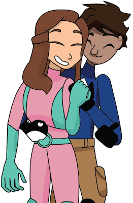
This is a picture of Taka and Ana Manuela together that I wanted to include in the Pitch Bible to show my idea of their relationship. One of the big things in Unmasking is that Taka and Ana Manuela would be together almost from the beginning. I want to show what an actual healthy relationship looks like and prove that having the characters together can be just as interesting as will-they-won't-they if you do it right. Mostly, you just need conflict to come from outside of the relationship and try to pull them apart. Their jobs would do this for them.


For obvious reasons, I want to keep most things about this character secret, but he does appear in the first episode (though not the original script). So, I wanted to include him here.

Here are some other villain designs. I also don't want to reveal too much about these characters either. However, I will say that they are much less professional than Neon Knight. Though in some ways, they're more volatile.

This is Another Burger Place, the run-down restaurant where Taka works. I haven't colored either of my environment designs yet, but I'll get to it.


And here is a shot of the St. Louis Superhero Housing, where Ana Manuela lives and trains with other superheroes-in-training.

Finally, this is a another picture I made to symbolize Taka and Ana Manuela's relationship. A funny thing happened. Wallgreens flagged this as "Professional Art," and I had to go down there and sign a form so that I could print it. I'm very happy with it.

I don't know what the path forward is, but I trust God will work it out. Lord, let your will be done. Show me what to do when I need to know. Thank you. Amen.

Wednesday, April 7, 2021

Computer Science Creative Expressions

In one of my computer science classes last year, we were required to create a "Creative Expression" which demonstrated that we understood the material. So, I decided to write short stories illustrating a concept I had learned in class. Finally, I've decided to include them on this blog, because I like some of the elements in them. They were each written with different age groups in mind.

https://drive.google.com/file/d/1At0eOBN243Llmiq1iN4C_Enl5FJcvM5v/view?usp=sharing 

This is the first story I wrote for class. This story was principally inspired by the Sir Cumference book series that my 3rd Grade teacher introduced me too. I always enjoyed them, and I was inspired by the idea of teaching math through a fantasy world. So, I took inspiration from that series when writing this short story. I also wrote it with my 8-year-old self in mind, though it could be for younger ages. I used Adobe Illustrator to make the illustration, which would become a theme. Right now, I'm much more comfortable with Illustrator than with Photoshop. Illustrator just seems more intuitive. It lets me do what I actually expect to be able to do with the software.

https://drive.google.com/file/d/18Q4z7aLcZrIl97ydPg2rfsRDTh5huv2X/view?usp=sharing

This is the second story I wrote for class. It's meant for kids who are a bit older, maybe 10-year-olds to preteens. I don't know. The concepts here are a little more complex, but I tried to maintain the same format I had in the first story without copying the formula exactly.

https://drive.google.com/file/d/1CehQd3KnOo4oAYUGogpA5dmVQ0yP7xKo/view?usp=sharing

This is the third story I wrote for class. It was intended for all ages, but especially adults and young adults. I explored more adult themes in this one and added more atmosphere. My teacher for the computer science class told me she "very much enjoyed reading this story." 

I hope I get the chance to write other short stories in the future. God's will be done. Lord save us all. Amen.


Friday, December 11, 2020

Self Portrait Animation

This is the fourth and final animation I did for my 2D animation class. Its style is inspired by Bill Watterson and the character Oswald the Lucky Rabbit. The trees and the other background elements were inspired by the style of the Bible Project videos, specifically "The Day of the Lord" video. For this assignment, we were supposed to turn a version of ourselves into something else. Our wonderful teacher suggested a spirit animal or animal totem, so I chose a rabbit because I thought it would be something I was capable of doing. I wanted to do a walking cycle, since it's a mainstay of animation. I'm really happy with how it turned out. I remembered to animate the shoulders, hips, etc. this time instead of having the arms just kind of swing robotically back and forth like I did in 3D animation class.

Originally, I was planning to have the transition between the two be very slow and almost indiscernible at first. But then my teacher suggested just having an object obscure the change and I thought that sounded like a fantastic idea. I might still want to come back to this concept when I'm better with animation and Adobe. 

My dad asked me "why a rabbit?" I like rabbits. I identify with rabbits. You may have noticed one or two on this blog.

This year has been such a disaster for everyone else, but God has really blessed me in all of this. Praise God. Your mercy is great. God, please save all the hurting people. Amen.

Blue Rhapsody Student Animation


This is the third animation I did for my 2D animation class. It's animated to the tune of "Rhapsody in Blue" by George Gershwin (you may recognize it from Disney's "Fantasia 2000" or many other sources). In addition, the art is inspired by the paintings "Several Circles" by Wassily Kandinsky and "Triumph of Kazimir Malevich at the Biennale in Venice" by Aura Visual. It was made in Adobe Animate. I've always liked "Rhapsody in Blue," and I'm glad I got the chance animate something to it.

God's will be done. Thank you for getting me through this semester.

Symbols Animation Dance


This is the second animation that I did for my 2D animation class this semester. It was my first serious and good attempt at character animation in Adobe Animate. This dance was partially inspired by the Bees Gees dance for "Stayin' Alive." I needed something simple and repeatable that read well in 2D for the assignment, and that dance instantly came to mind. I could've added more in-betweens, but I am satisfied with this. 

Praise God, always and forever. Amen.

Sunday, September 6, 2020

Inkwell Countdown


This is the first animation that I've done for my 2D animation class that I started this semester. It was my first time seriously using Adobe Animate, and I'm satisfied with how it turned out. I don't quite understand how other people who use Adobe Animate can have their lines look so polished. Apparently I just need to play around with the tools more. It's inspired by the old Fleischer cartoons. They had a recurring gag where a character would come out of the drop of the inkwell. So I decided to simplify that and use it to make numbers instead. For class, we were supposed to to a countdown of some kind. The hardest thing was the timing, and I think I would want to improve on that if this was going to be a professional piece. But for now I just don't have enough experience.

Anyway, I praise you, God, that you helped me get this done tonight. You're so kind. God's will be done for this animation. Love you. Amen.