Earlier on this blog I posted a script that I created in Screenwriting class for a television series called Unmasking. This semester, I'm taking an Independent Study course where I'm creating a Pitch Bible for a television series. I chose Unmasking as the series. So, I wanted to include some of the art I've come up with here. Some of this is rough concept art that I will finalize. Of course, if this series were ever to become real, I would want to refine all of these designs much more to industry-level quality.
These pictures are some of the doodles I created of Taka "Leapman" for Unmasking. He's one of the two central characters.
And this is an image of Taka that I did in Adobe Illustrator after receiving feedback on my design from my Professor and classmates. Some people have wondered why I use Illustrator. I find it more intuitive and comfortable than Photoshop. My classmates complimented me on how Taka's suit looks very homemade. That makes me happy, because that's how it's supposed to look.And this is Ana Manuela "Nulife" Montano. She's the other protagonist of Unmasking. It took me some time to get to this design, and it's still not final. But I like how it's coming along. It communicates the character better than some of my older designs. I think mostly the suit might need some adjustments in the future. My classmates have told me that they like the color scheme of her suit. That makes me happy. I wanted it to look good on its own, but I also picked Nulife and Leapman's color schemes to look good next to each other.
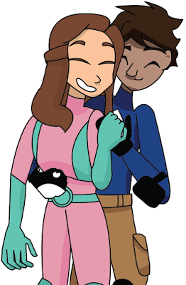
This is a picture of Taka and Ana Manuela together that I wanted to include in the Pitch Bible to show my idea of their relationship. One of the big things in Unmasking is that Taka and Ana Manuela would be together almost from the beginning. I want to show what an actual healthy relationship looks like and prove that having the characters together can be just as interesting as will-they-won't-they if you do it right. Mostly, you just need conflict to come from outside of the relationship and try to pull them apart. Their jobs would do this for them.
For obvious reasons, I want to keep most things about this character secret, but he does appear in the first episode (though not the original script). So, I wanted to include him here.
Here are some other villain designs. I also don't want to reveal too much about these characters either. However, I will say that they are much less professional than Neon Knight. Though in some ways, they're more volatile.
This is Another Burger Place, the run-down restaurant where Taka works. I haven't colored either of my environment designs yet, but I'll get to it.
And here is a shot of the St. Louis Superhero Housing, where Ana Manuela lives and trains with other superheroes-in-training.
I don't know what the path forward is, but I trust God will work it out. Lord, let your will be done. Show me what to do when I need to know. Thank you. Amen.


